
Daniel George Mckoy
About the work
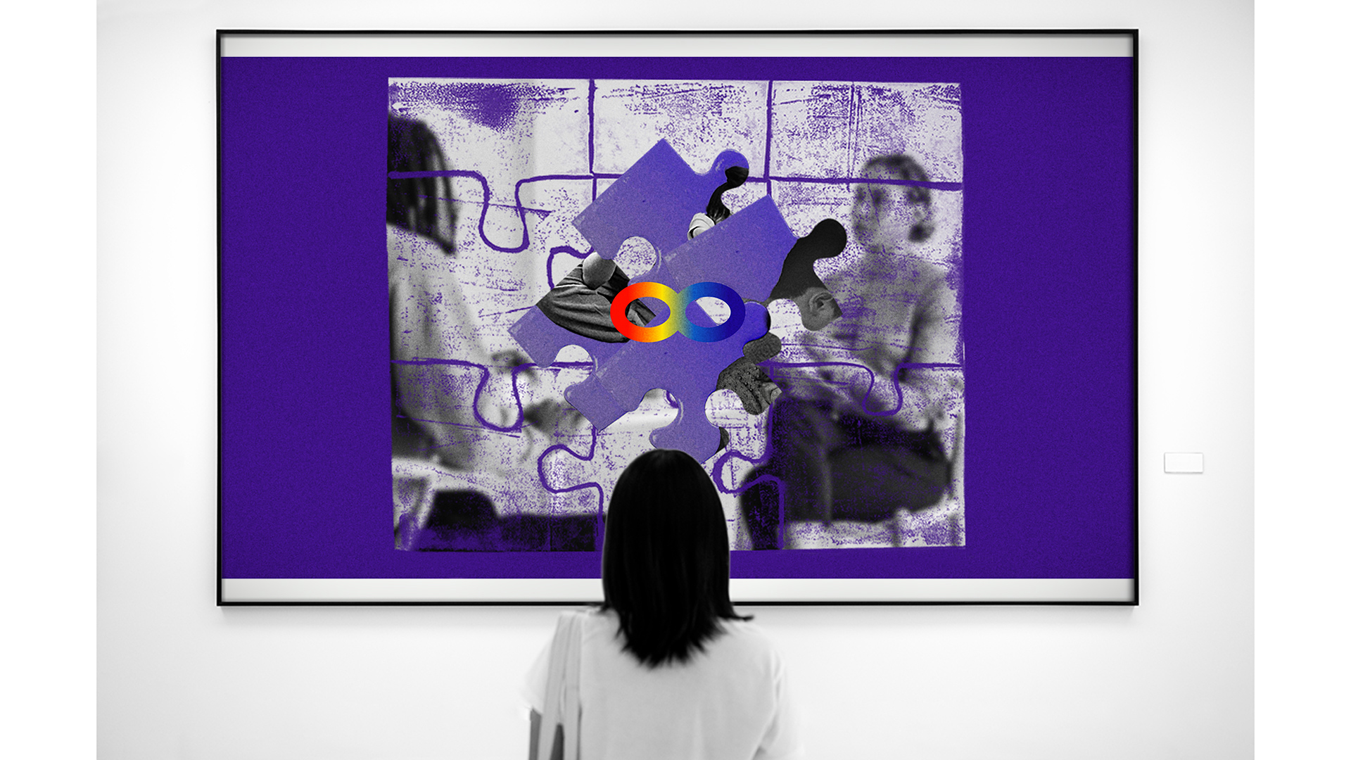
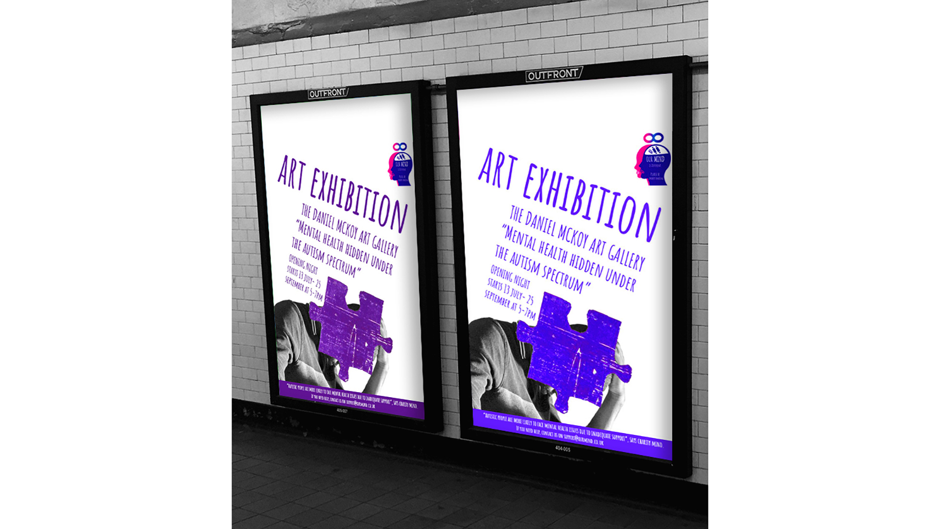
Images 1 & 2. Branding and Advertising Campaign: “Mental Health Being Hidden Under the Autism Spectrum”.
My brief required me to choose a contemporary topic of my choice. I chose to raise awareness of the mental health and wellbeing of autistic people.
Influenced by a self-portrait filled texture, I used Photoshop to confine my self-portraits to my jigsaw pattern and my stock imagery to my lino printed jigsaw puzzles, with a 3D jigsaw piece filled with my self-portrait to see how the images looked under textures. But to refine the fictional exhibition artwork into final pieces, I added more 3D jigsaw pieces with other fictional autistic people concealing their emotions to imitate my topic, with an autistic infinity symbol. I also blurred the jigsaw puzzle for viewers to focus on the isolated jigsaws.
I considered refining my first experiments into exhibition posters. I replaced the painted jigsaw with a lino printed jigsaw to create a coherent brand across my exhibition artwork and series of posters. I used a typeface Amatic, inspired by my research into a teenage autistic programme’s text design.
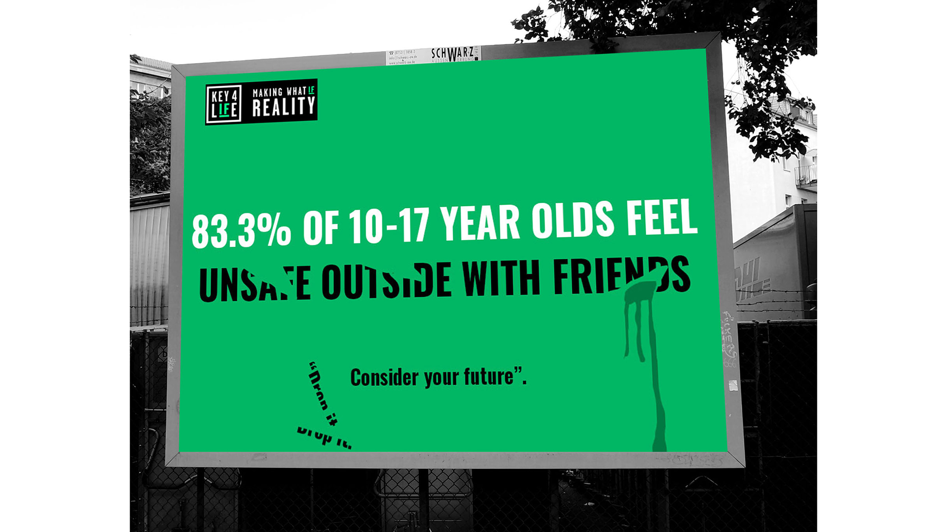
Image 3. Live Project: Key4Life Knife Crime Awareness Campaign.
My brief from a charity called Key4Life required me to create a text-based campaign using either a statistic or a compelling story. This was to encourage young people to turn away from knife crime and do better things with their life.
I found out from surveys conducted that 83.3% of 10–17-year-olds feel unsafe outside with their friends. So, I used Photoshop and Illustrator to experiment with partial erasion, slices and reversed colour of “unsafe outside with their friends” to illustrate the statistic.
I then went onto slice the phrase equally at and in different directions. I liked the second slicing idea and decided to choose it as my final poster with blood since it had more movement that reflected a knife being thrown away and the angle of the plunge.
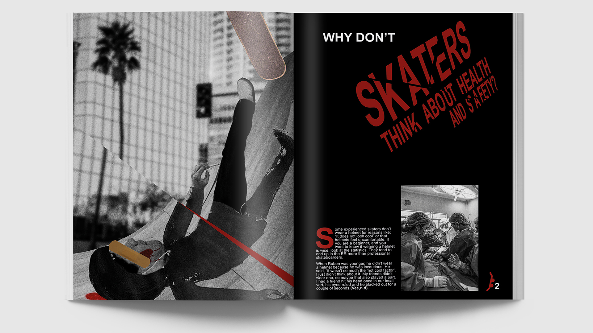
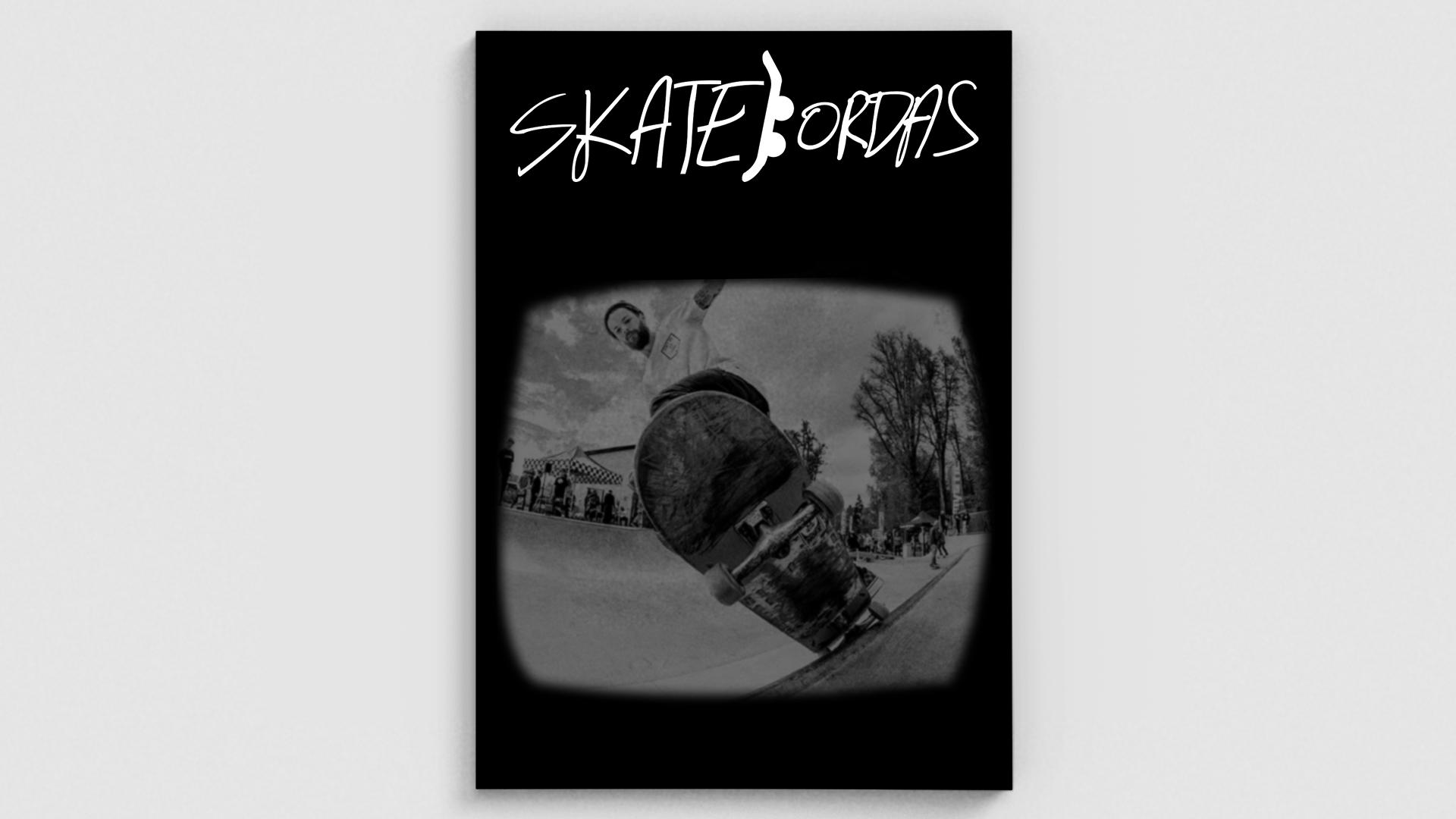
Images 4 & 5. Editorial Design Project: Skatebordas Magazine.
I was required to choose a piece of editorial design based on a chosen topic. Illustrator and Graphic Designer Doug Rodas’ grayscale photography and his handwritten text in his redesigned magazine inspired me to also design a magazine exploring the media.
I named my brand identity Skatebordas to reflect young people using abbreviations when communicating.
For my magazine layout explorations, I played with having black text on white on the first page and the opposite on the right page and vice versa, with and without a skateboarder layered over a large S of skate etc. To effectively respond to the topic, I broken the article title influenced by Designer Luke Williams slicing and replaced a skateboarder, with a mixed media illustrated skateboarder. This effectively communicated broken bones from skateboarding injuries from disregarding safety gear. Therefore, I chose this as my final piece. Eleanor Shakespeare’s drips inspired the spraypaint and her collages inspired me to include a collage for my article and Designer Martin Venezky’s layering inspired me to layer a plaster over my collage.
Student Bio
While on the course some of the highlights have included pitching my ideas to the director of design agency Stencil and class for branding and advertising module. This has built my confidence in presenting my work and it also has developed my communication skills. Working on live briefs has developed my experience of working in the graphic design industry.
I have enjoyed creating awareness campaigns within modules I have studied, further developing my passion for designing posters, and using InDesign to layout content when designing magazines.
Collaborating to create a digital campaign focusing on sustainability for a module gave me experience relevant for a challenge on the NTU Grads4Nottingham Programme I applied for and was successfully accepted onto. I have also had an opportunity to do a work placement with Mencap in the second year of my course.
More from Daniel: